Chainletter
Designer and product lead on Chainletter's university admin MVP: defined the information architecture, credential verification flows, and product roadmap.
Role
Lead UX/UI designer
Co-product lead
Timeline
Dec 2024 - Apr 2025
Team
5 people
Tools
Figma
FigJam
ChatGPT
Claude
Results
- Helped secure 2 university pilot partnerships as a direct outcome of the redesigned admin MVP and verification flows.
- Delivered the core product loop with a tightly scoped MVP cut list.

Overview
Chainletter is a blockchain-based platform that allows universities to have their degrees and certifications be verifiable to any and all outside organizations with just the original file.
For this project, I was tasked with redesigning the administrator-facing part of the application, the first real MVP for the product, to make it usable, clear and scalable. The end goal: help university admins upload student degrees without needing to understand anything about blockchain.
The engagement was a hybrid design and product role rather than a pure UX/UI redesign. Alongside the interface work, I defined the information architecture and prioritized the development roadmap with the founding team.
The problem
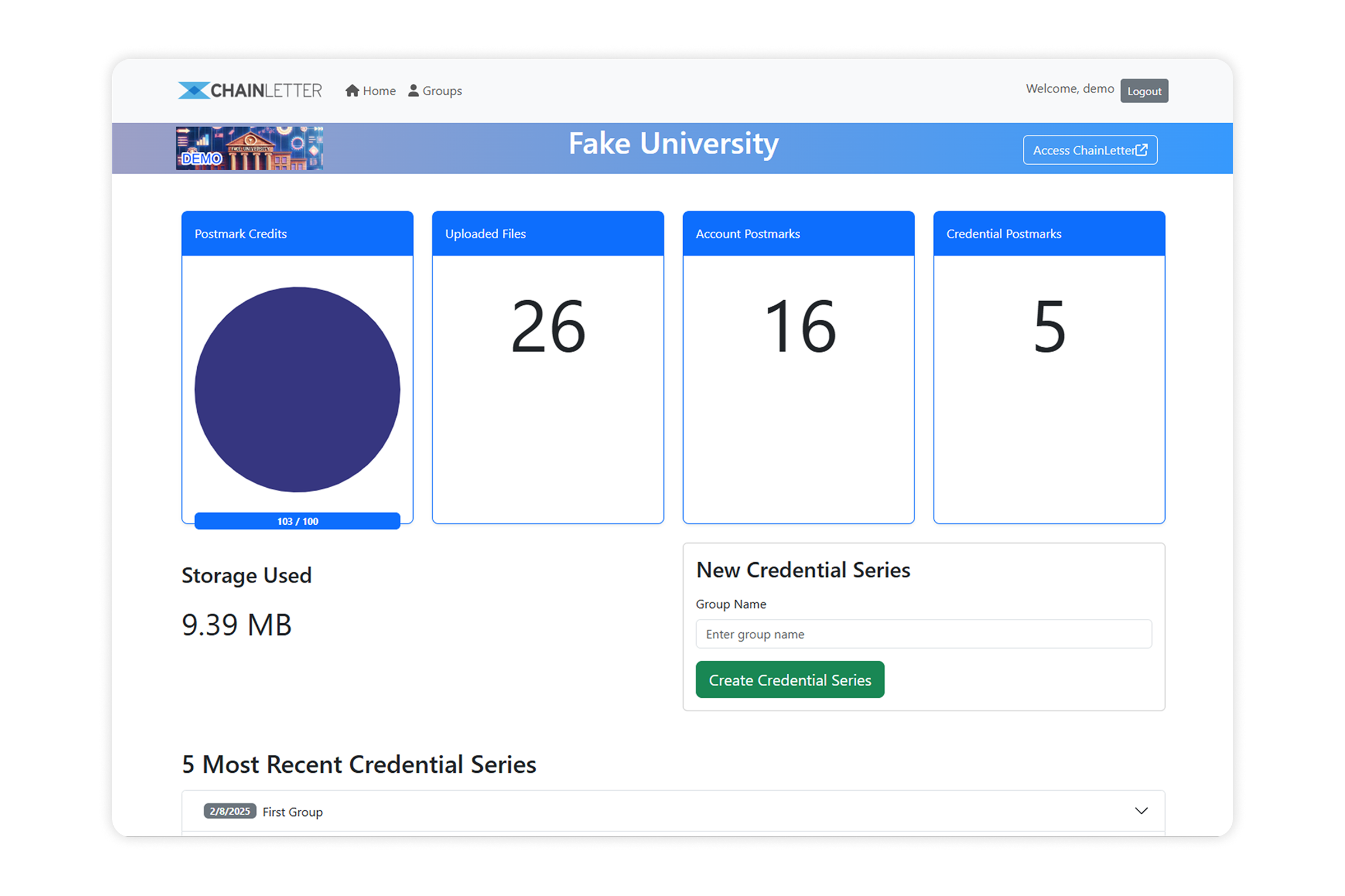
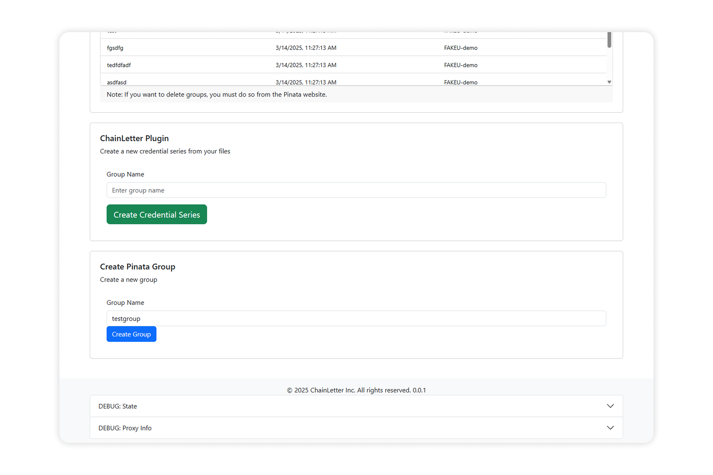
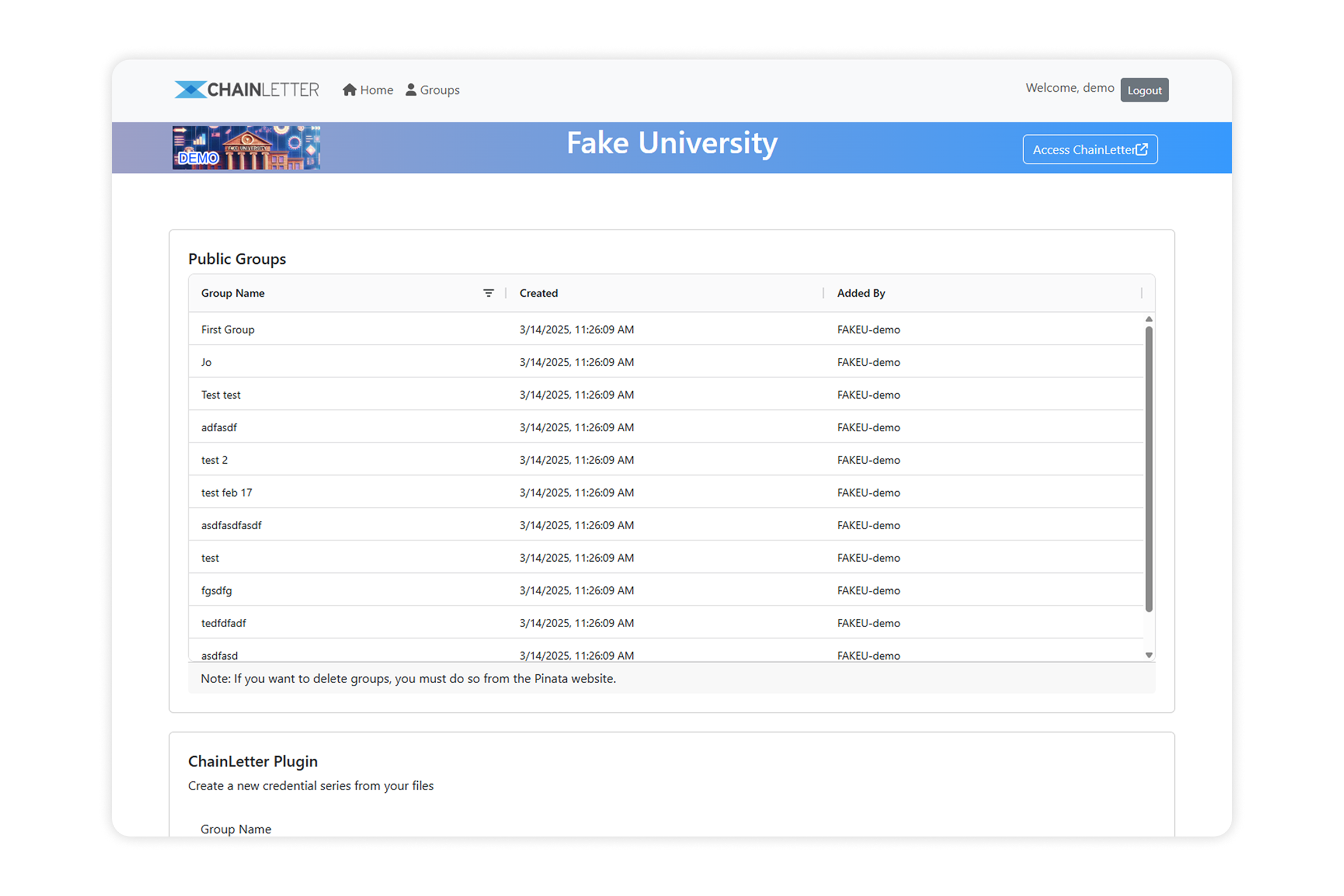
The first version of Chainletter had a lot of issues: visually, functionally, and structurally.
Issue #1: UI design
The UI felt outdated and disconnected. There was no brand consistency and no real design system.
Issue #2: Unintuitive interactions
Basic interactions were unintuitive and required lots of guesswork.
Issue #3: Microcopy & terminology
Terminology throughout the app was inconsistent and often too technical.
Issue #4: Blockchain unfamiliarity
Blockchain introduced permanent, irreversible actions and the interface did little to prepare users for that.
Target audience
Our MVP was built specifically for university administrators: the people responsible for managing and verifying academic records.
These are professionals who work within formal institutional systems, follow established document workflows, and are accountable for the integrity of official records. They don't need to understand blockchain. They need to trust that the tool is as reliable as the documents it's certifying, and that they won't accidentally do something irreversible.
Discovery
The project was early-stage and fast-moving, so we worked with the resources we had. The Chainletter team brought deep knowledge of university workflows and procurement cycles, which gave us a strong proxy for understanding the user's environment and expectations.
I led two syncs per week with the full team (founder, dev, and ops) to gather feedback, pressure-test naming decisions, and align on direction. Those sessions were especially useful when it came to terminology and navigating the constraints that blockchain introduced. We also did a quick competitor review to understand where the category was and where it wasn't.
My role & process
I led the project as both UX/UI designer and co-product lead: a hybrid designer and product manager role, not a design-only brief. I defined the information architecture, designed the core credential issuance and verification flows, and prioritized the development roadmap with the founding team.
Beyond design, I ran twice-weekly syncs with the founder and dev, translated stakeholder and institutional feedback into product decisions, and had final say on terminology and interaction patterns. I wasn't executing a brief. I was helping define what the product should be.
- Designed all lo-fi and hi-fi screens in Figma, using a Bootstrap UI kit as the base
- Worked with ChatGPT and Claude in parallel to brainstorm flows, stress-test layouts and copy.
- Customized the components to align with Chainletter's brand and accessibility needs
- Worked closely with Oleksii (our developer) on implementation: daily asyncs and live calls
- Held weekly design reviews with the full team
We intentionally kept things lean and fast-moving, without heavyweight process overhead.
Core challenges
1. Terminology & mental models
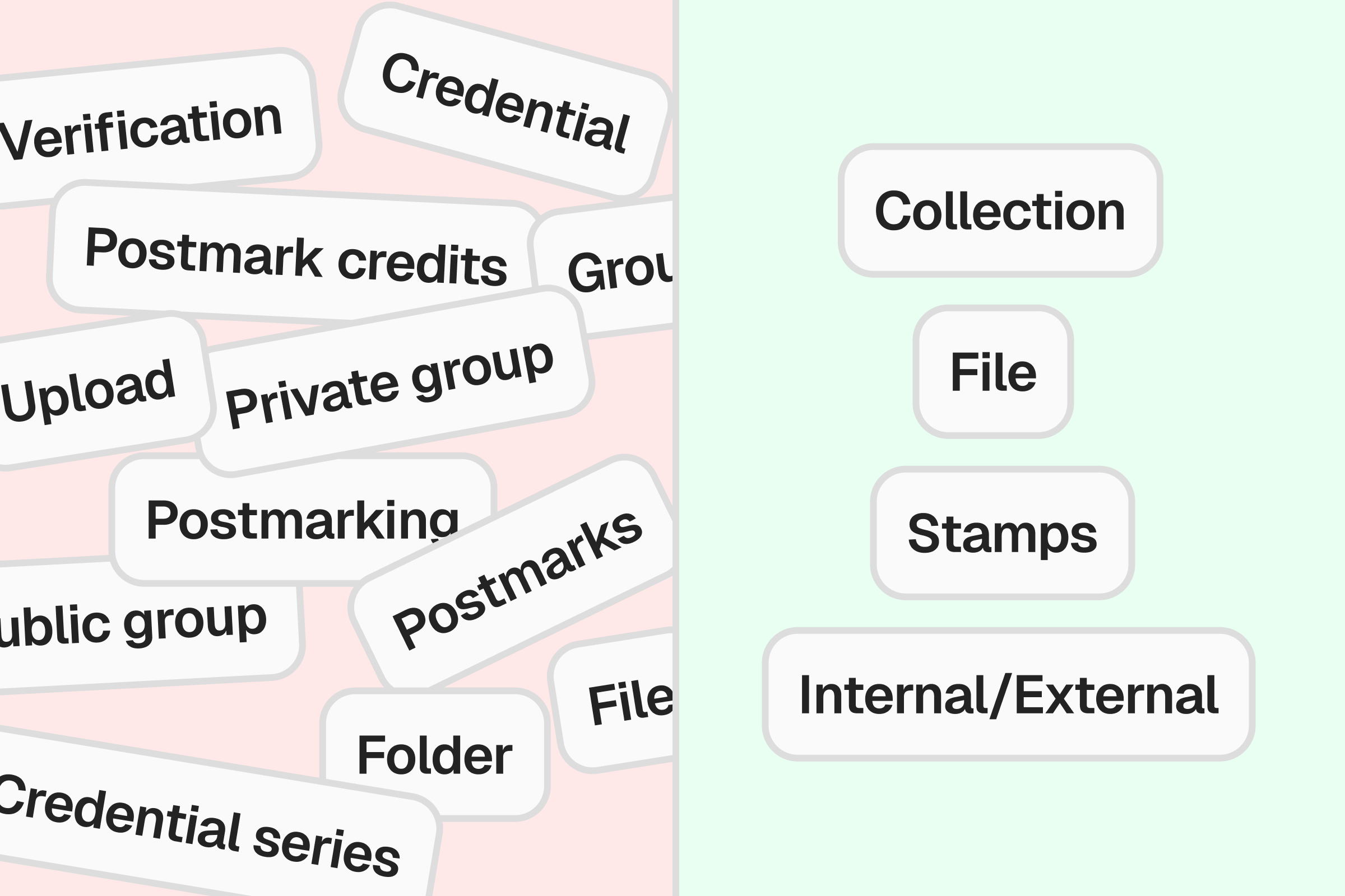
The biggest challenge was explaining blockchain interactions to non-technical users without using blockchain terminology.
You can't just say "it works like Google Drive" when stamping a collection permanently uploads data to the blockchain, but going full crypto-speak wasn't an option either.
Solution
- Defined a simple internal glossary as an abstraction on blockchain-related terminology (e.g., Collections, Files, Stamps)
- Iterated on terminology with the team until it felt clear and trustworthy
- Reinforced concepts with tooltips, contextual help, and warning modals across the UI
2. Permanent actions
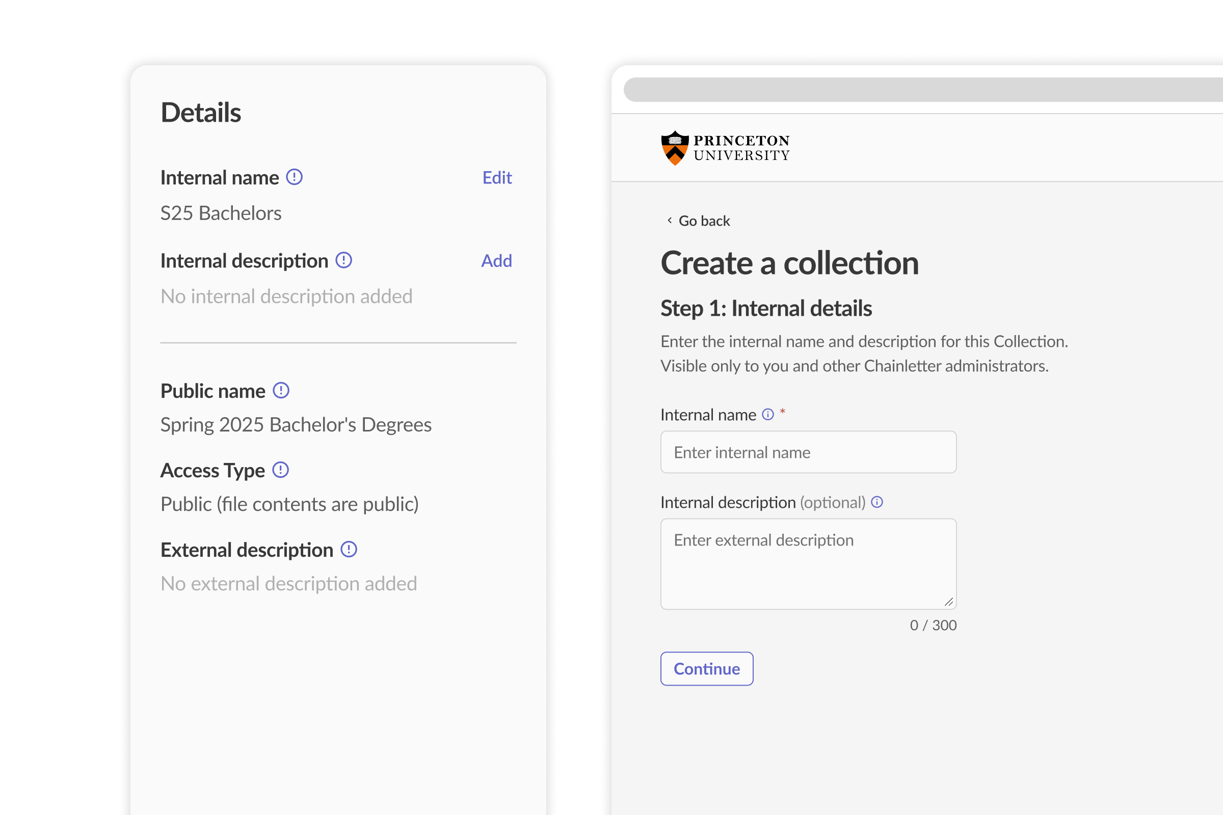
The core architectural challenge was separating editable, internal state from the point of no return. Quite a few actions within the UI had permanent consequences, and needed to be communicated as such in a way that empowers users, not burdens them.
The core solution: a two-state collection model
The central UX insight (and this was mine, not a technical requirement) was splitting the collection flow into two distinct states. Step 1: an internal draft with an editable name and description. Step 2: a permanent external record, locked once stamped onto the blockchain. This distinction didn't exist in the original product. Users could stumble into permanence without knowing it.
Everything else in this section (the modals, the non-editable fields, the copy) was built to make that two-state model legible at every level of the interface.
Additional solutions
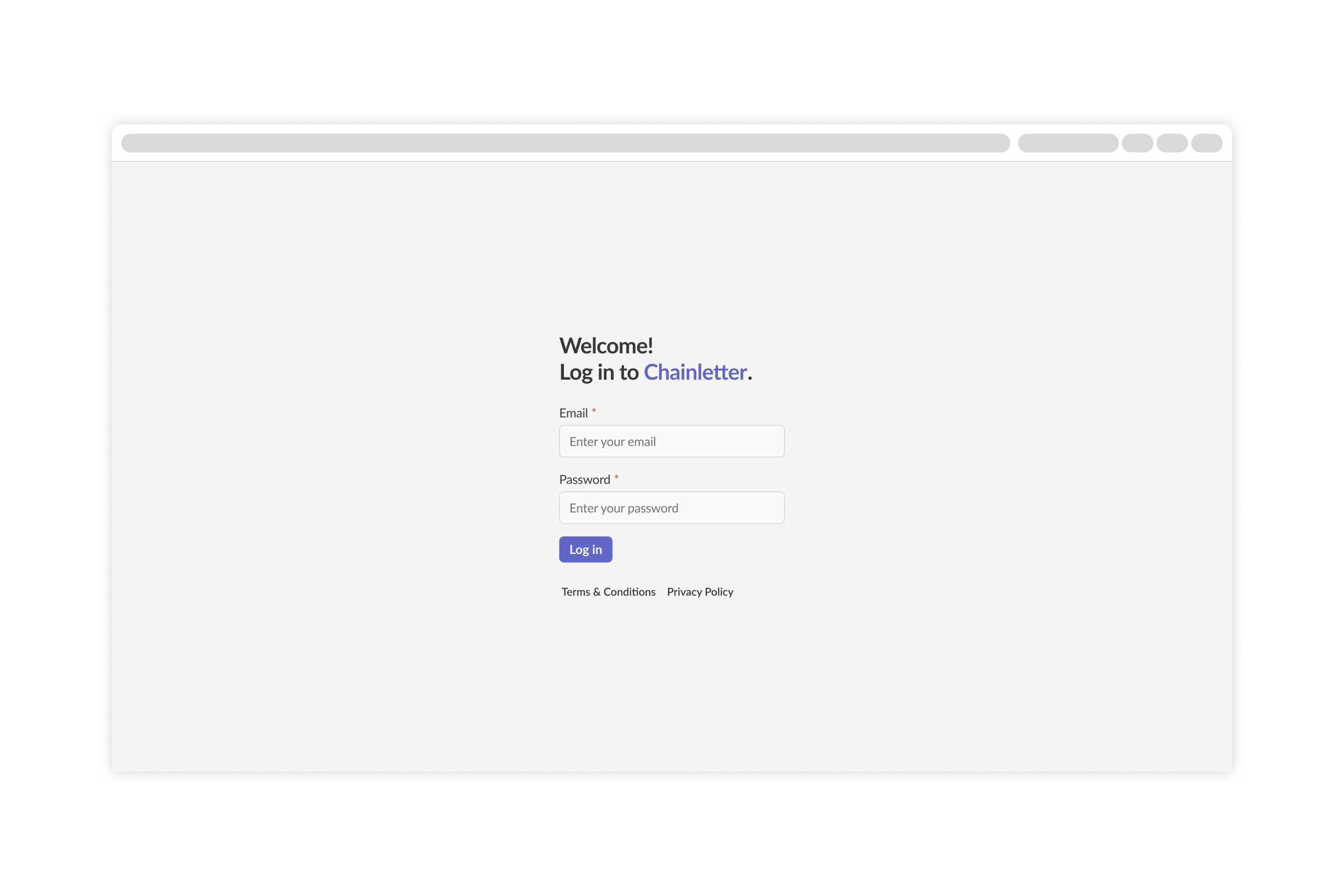
- Added warning modals and non-editable fields post-stamping
- Used plain, direct language to explain consequences up front
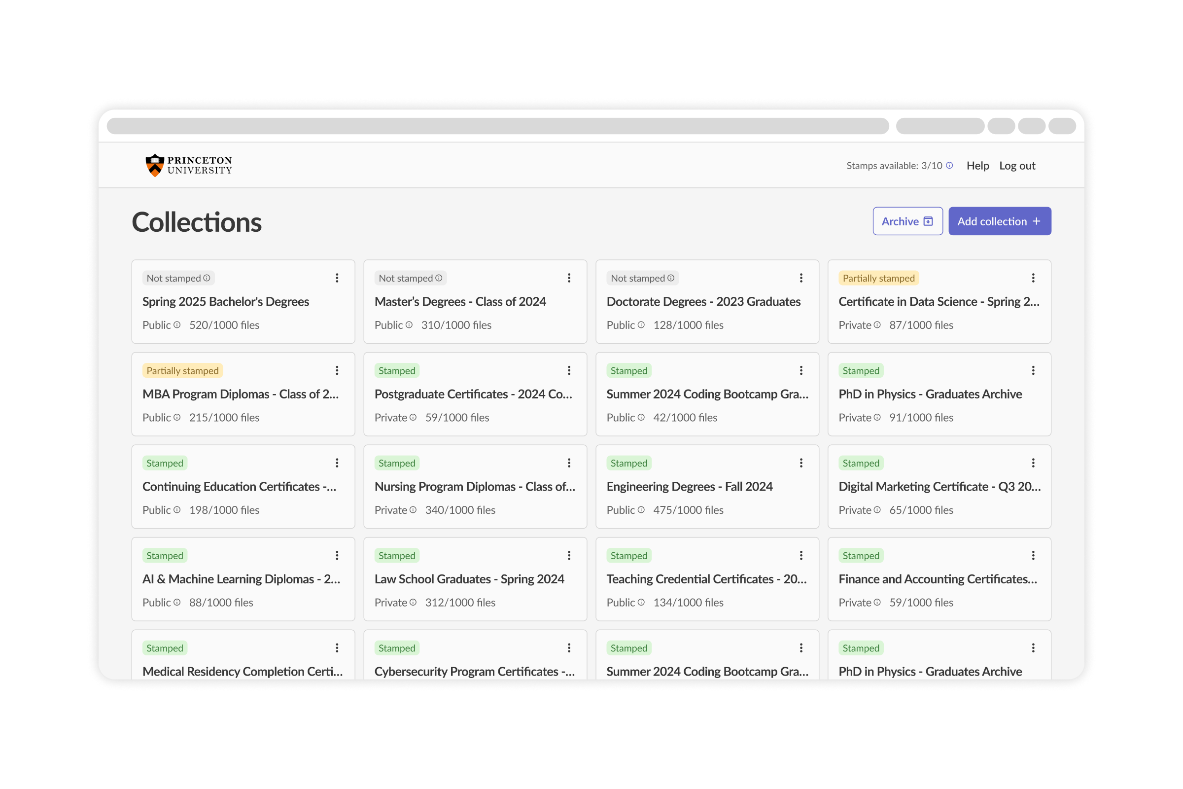
3. File upload UX & error handling
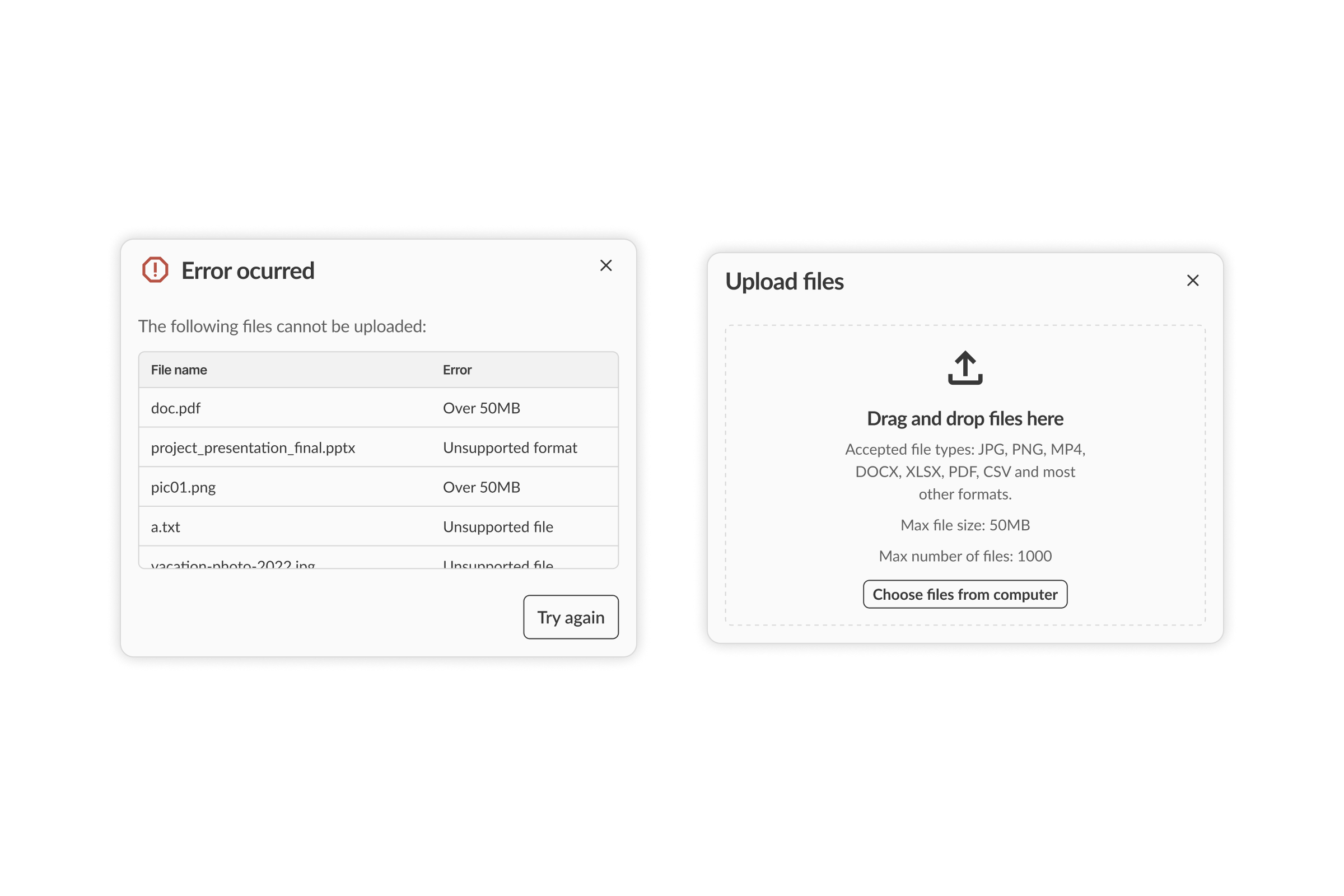
The upload flow was hidden, lacked context on accepted file types, and gave poor feedback when something went wrong.
Solution
- Made the file upload UI always visible and clearly labeled
- Grouped errors into two buckets: shown before upload and after upload
- Displayed error tables in modals so users could understand and fix issues quickly
Tradeoffs & scope
To stay on deadline and deliver a solid MVP, we scoped tightly and cut the following:
- Advanced filtering and search across Collections and Files
- Multi-file selection and batch actions
- Admin permission management / user roles
- Settings/account page
We kept focus on the core loop: creating collections, uploading files, stamping and verifying them, viewing status clearly, and getting help when needed.
Results
- Helped secure 2 university pilot partnerships as a direct outcome of the redesigned admin MVP and verification flows.
- Delivered the core product loop with a tightly scoped MVP cut list.