Kyruus Health
Led Kyruus Health's largest accessibility improvement: 60+ of 93 WCAG 2.1 AA tickets resolved solo across Pre-Visit, a 64% reduction in accessibility debt.
Role
Product designer
(accessibility lead)
Timeline
Jun - Sep 2023
(3 months)
Team
Cross-functional
design, engineering, legal, audit firm
Tools
Figma
Google Sheets
Jira
Results
- Resolved 60+ of 93 accessibility tickets from the WCAG 2.1 AA audit in 3 months, a 64% reduction in accessibility debt.
- The largest single accessibility improvement in Kyruus Health's history.
- Contributed to a 10% increase in check-in completion after remediation.

Context
Kyruus Health is a Boston-based healthcare technology company. Its flagship product, Pre-Visit, is a patient check-in application used by healthcare providers across the US. In 2023, an external accessibility audit identified 93 issues against WCAG 2.1 AA standards, ranging from critical access blocks to moderate friction points, spanning every major user flow in the product.
I was the sole designer tasked with resolving the entire audit. The volume was only part of the challenge:
- There was no accessibility team and no established remediation process. I was building the workflow while executing it.
- The product was mid-migration from one design system (M2) to another (MUI/M3), which added a constraint to every solution.
- Many tickets required coordination with developers, the auditors, and in some cases the legal team, since HIPAA compliance was a recurring factor.
My job was to translate every audit finding into an actionable, dev-ready design decision: scoped, prioritized, and documented, while maintaining alignment across engineering, legal, and product.
My process
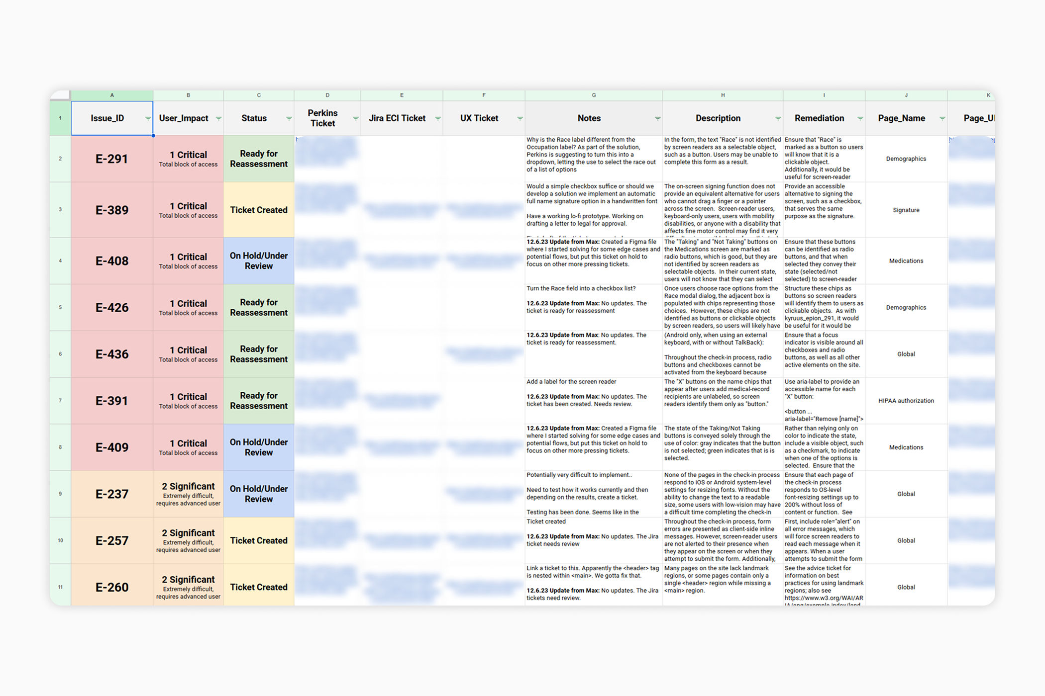
Working alone at scale meant I needed a repeatable process I could apply consistently across the full ticket set in a short window. I built a tracking system in Google Sheets, carrying over all data from the auditors' platform, where I documented every ticket's status, notes, communications, and decisions throughout the initiative.
For each ticket, I followed five steps:
1. Ticket analysis and WCAG guideline review
Review the ticket against the relevant WCAG criterion; coordinate with the auditors to clarify requirements and intent.
2. Current solution assessment
Examine the existing implementation from both a user-facing and code perspective, in collaboration with the dev team.
3. Identify technical and legal constraints
Map what's feasible given the MUI migration, development scope, and any legal considerations.
4. Research, iteration, and proposal
Iterate on solutions, pressure-test with devs and the design team, and produce a final dev-ready ticket with designs where required.
5. Documentation and tracking
Record all decisions, communications, and outcomes in Jira and Sheets for full team visibility and future reference.
Scope and notable tickets
The work spanned the full complexity spectrum: quick wins like color contrast adjustments, alt-text revisions, and ARIA label additions, alongside tickets requiring new component designs, restructured flows, and cross-functional alignment.
A few notable tickets beyond the quick-win category:
Taking / not taking medication buttons (E-408, E-409)
Two related critical-impact tickets: the medication status buttons weren't identifiable as selectable objects by screen readers, and their selected state was communicated by color alone. I explored edge cases and flows in Figma before creating dev-ready tickets addressing both the ARIA role issue and a visible state indicator to replace color-only feedback.
Race field and chips (E-291, E-426)
Two critical tickets around a custom race-selection component. The "Race" label wasn't identified as a selectable object, and the resulting chip selections weren't structured as buttons, leaving screen-reader users with no way to interact with or remove them. I worked with the team to restructure the component as an accessible input pattern.
Modal restructure (E-264, E-413)
The Terms of Use modal and the check-in flow's modal carousel both had focus management issues on open. I collaborated with engineering on a restructured modal component using the MUI M2 base, styled toward M3 specifications, resolving the focus behavior across both tickets simultaneously.
Deep dive
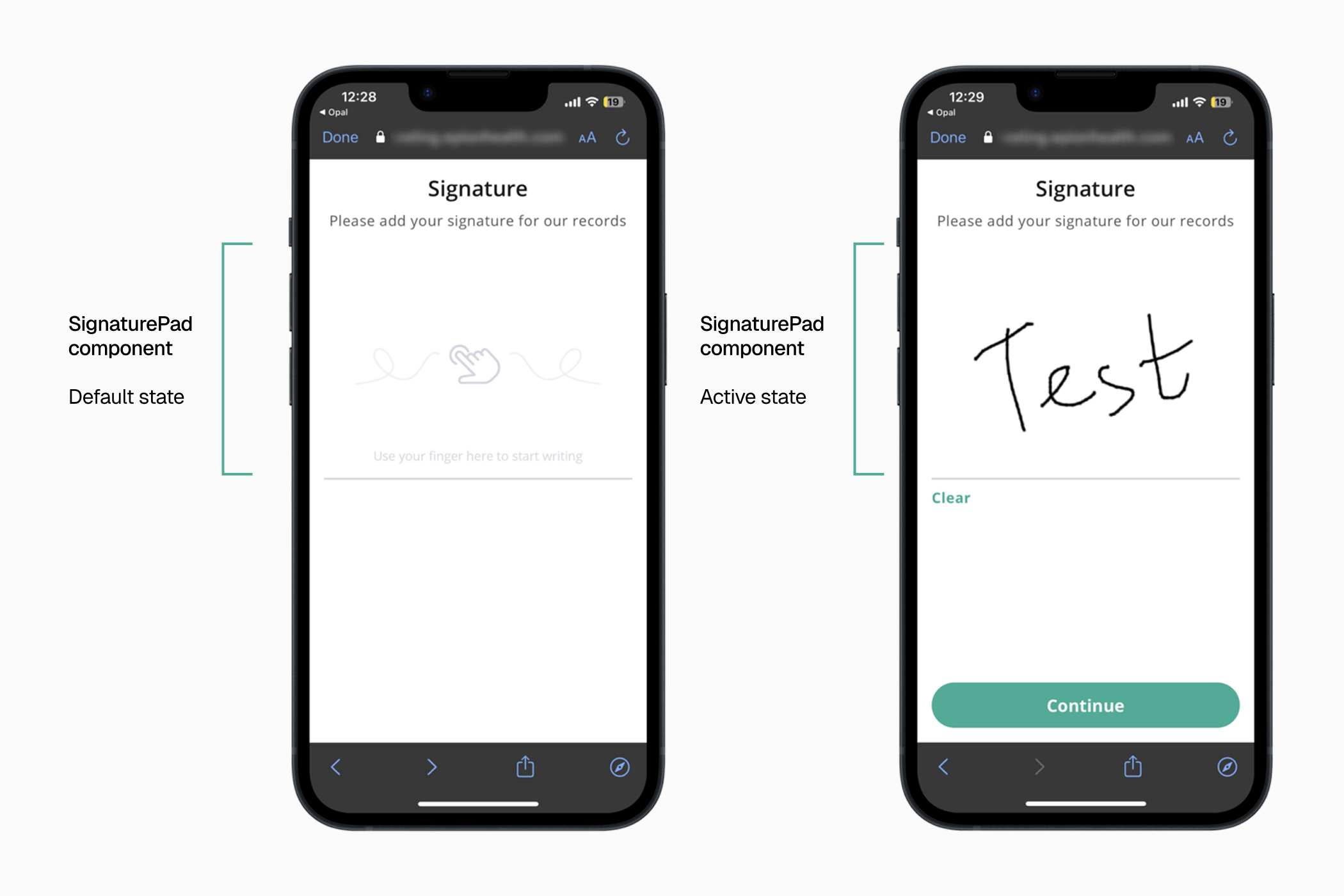
Of all the tickets in the audit, the SignaturePad replacement was the most complex and the most impactful: a critical-severity ticket representing a total block of access, affecting nearly every user flow in the product.
The problem
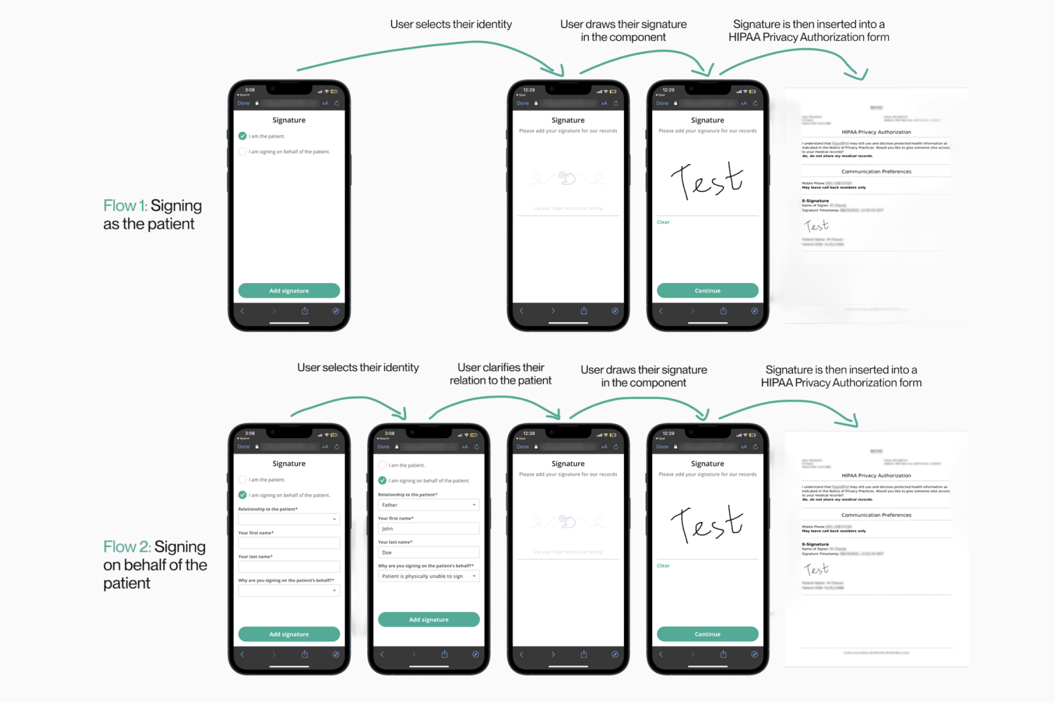
The on-screen signing component required users to drag a finger or pointer across the screen to produce a signature, making it completely unusable for screen-reader users, keyboard-only users, and anyone with a condition affecting fine motor control. Since a signature was required to complete nearly every flow in Pre-Visit (consent forms, patient intake, insurance verification), this wasn't an edge case. It was a gate that blocked a significant portion of users from using the product at all.
Research: four options
The auditors pointed us toward DocuSign as a reference for accessible e-signature patterns. After reviewing DocuSign and other e-signature tools, we identified four candidate approaches:
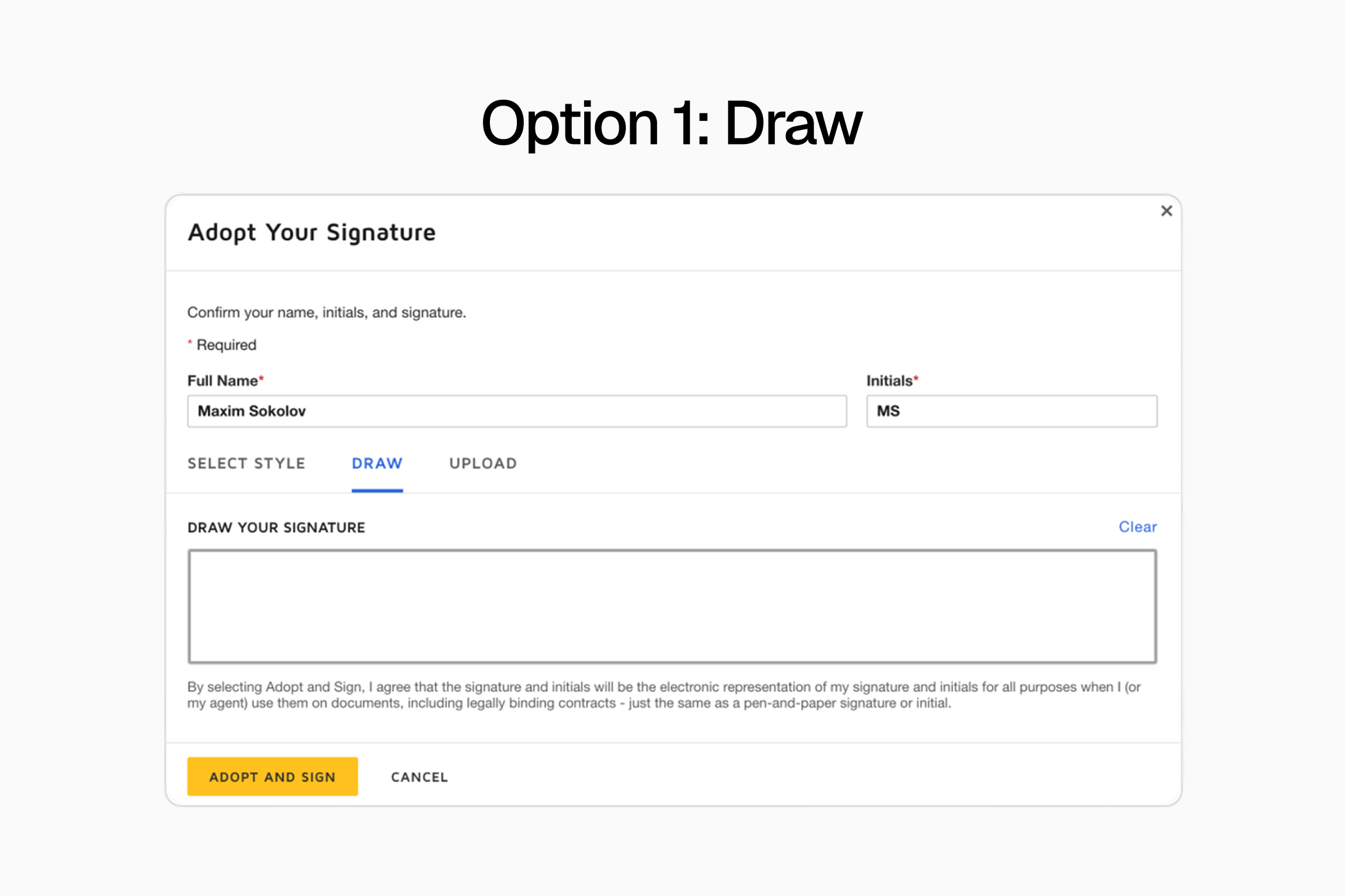
Option 1: Draw (current)
The existing solution. Could not stand alone as the only option.
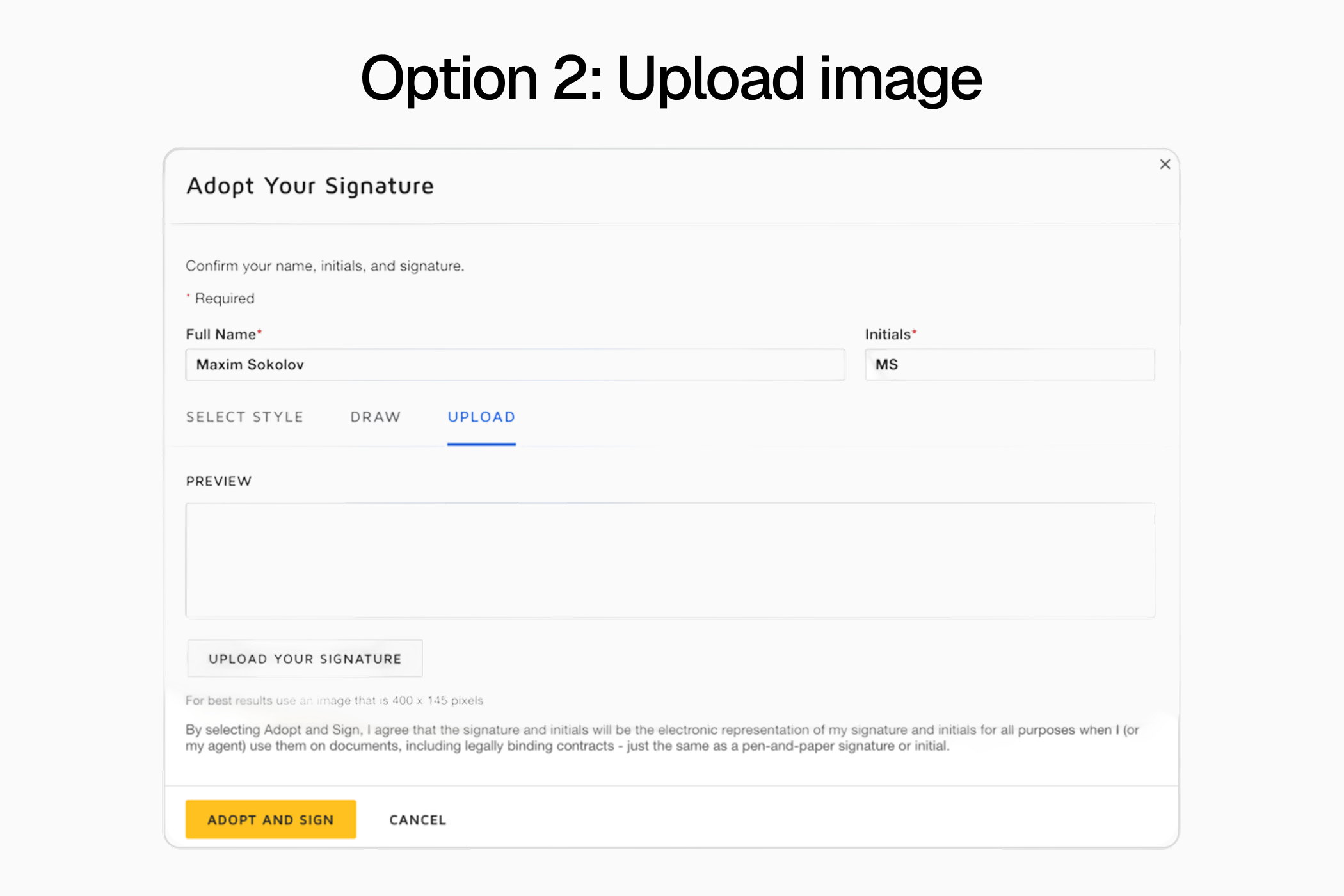
Option 2: Upload image
Upload a photo of a handwritten signature. Added significant friction and did nothing for users who couldn't produce a signature in the first place.
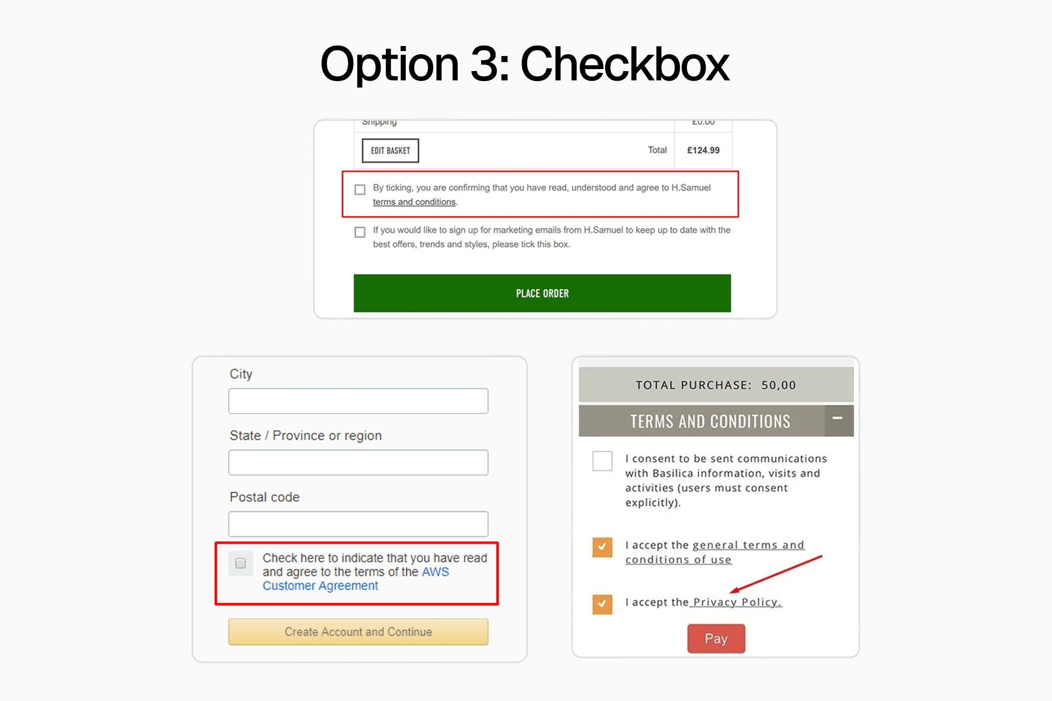
Option 3: Checkbox
A simple "I agree" checkbox, familiar from Terms & Conditions flows. Fully operable by assistive technology, but unclear whether it met HIPAA requirements for a legally binding signature. Flagged for legal review.
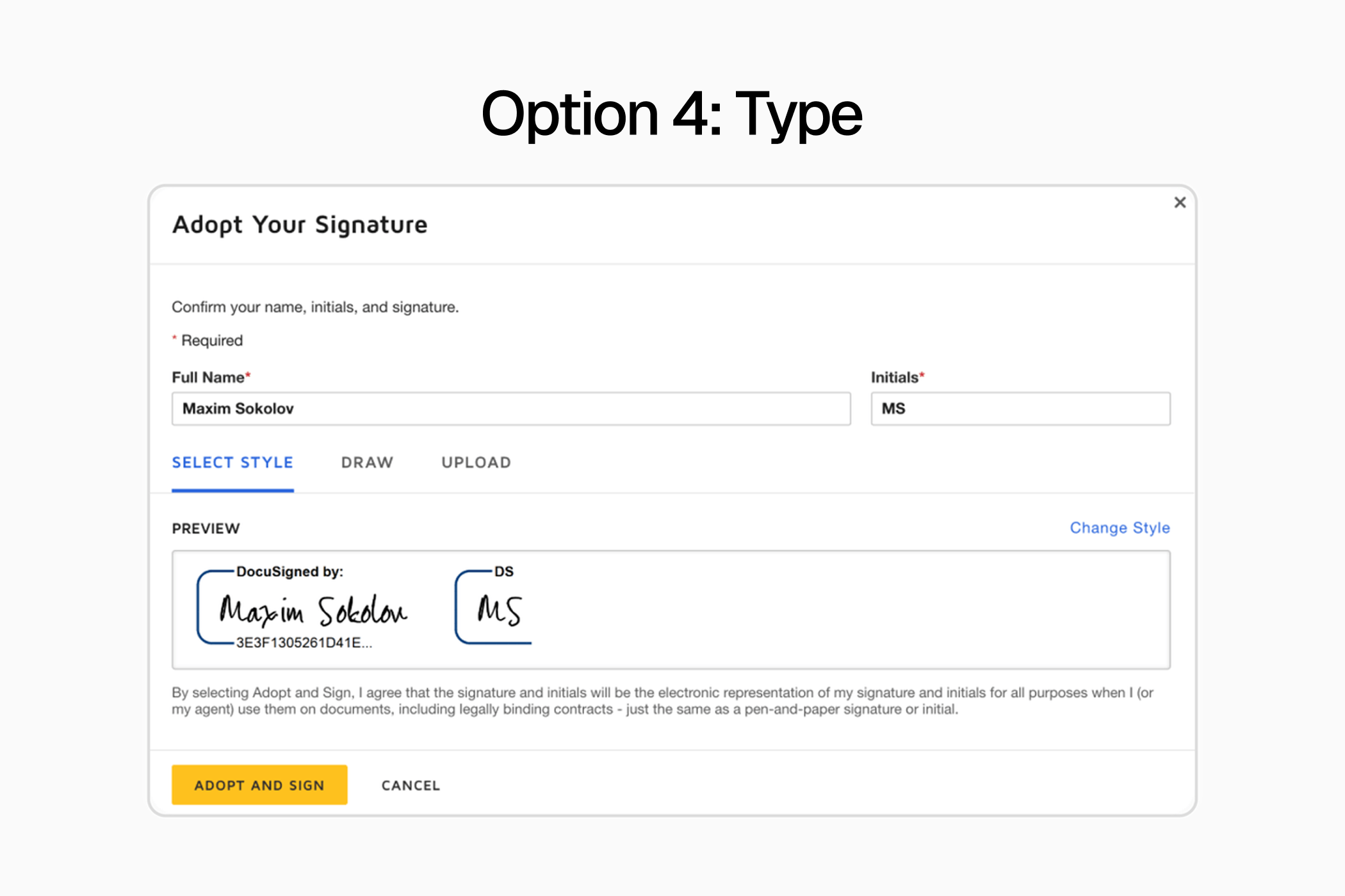
Option 4: Type
A text input where users type their full name, rendered as a handwritten-style signature. Recommended directly by the auditors. Fully accessible, pending the same legal review.
Legal review
I prepared a presentation outlining the Checkbox and Type options, their accessibility rationale, and the technical feasibility of each, and presented it to the legal team. Legal approved the Type option and ruled out the Checkbox, which did not meet HIPAA requirements for a binding signature.
Design
With Type approved, the next challenge was implementation within the MUI migration: all components had to stay within the framework, with slight visual modifications where necessary.
MUI offered two components with tab-like switching behavior: Tab and Button Group. I explored both, testing different layouts and placements within the signature UI. I ultimately chose Tab, positioned above the signature area, since it followed the natural top-to-bottom reading pattern and created a better visual hierarchy.
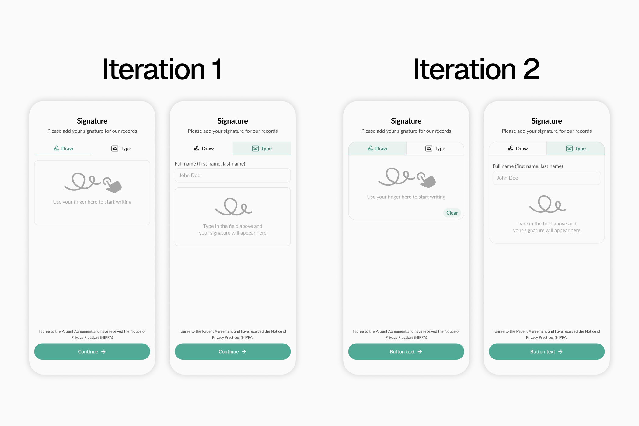
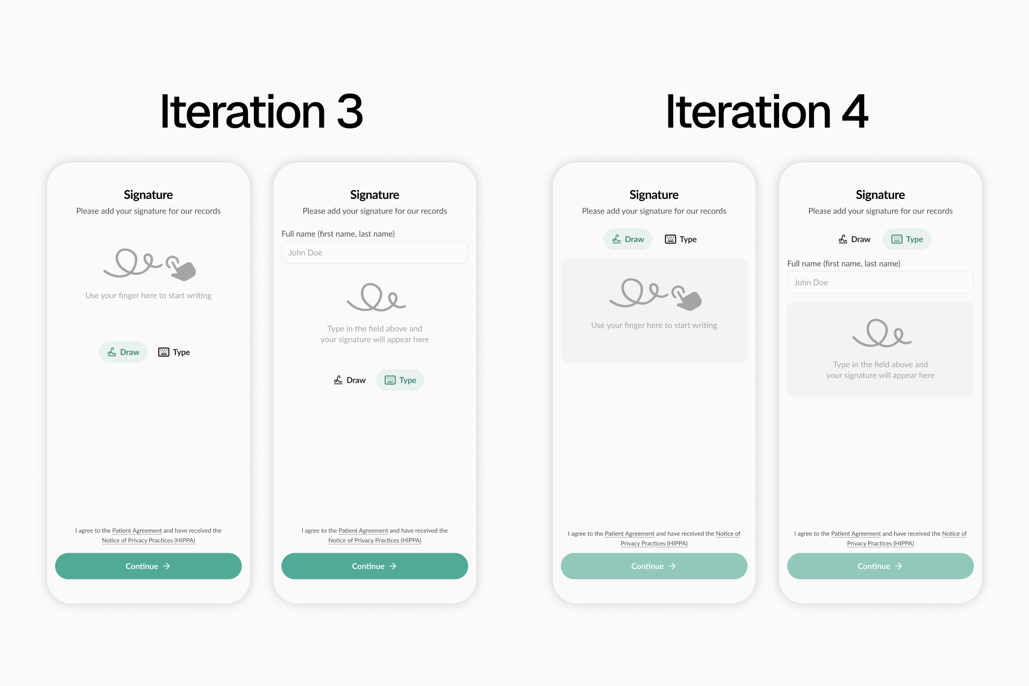
Solution
The final component presented users with a Tab group switching between Draw and Type modes, positioned directly above the signature area. The Type input was fully screen-reader accessible and keyboard operable. With visual customization to align the MUI component with the existing application style, the ticket was ready for engineering handoff.
The result: the existing Draw experience remained for users who preferred it, while a fully accessible Type alternative removed a critical access block from the most user-critical component in the entire product.
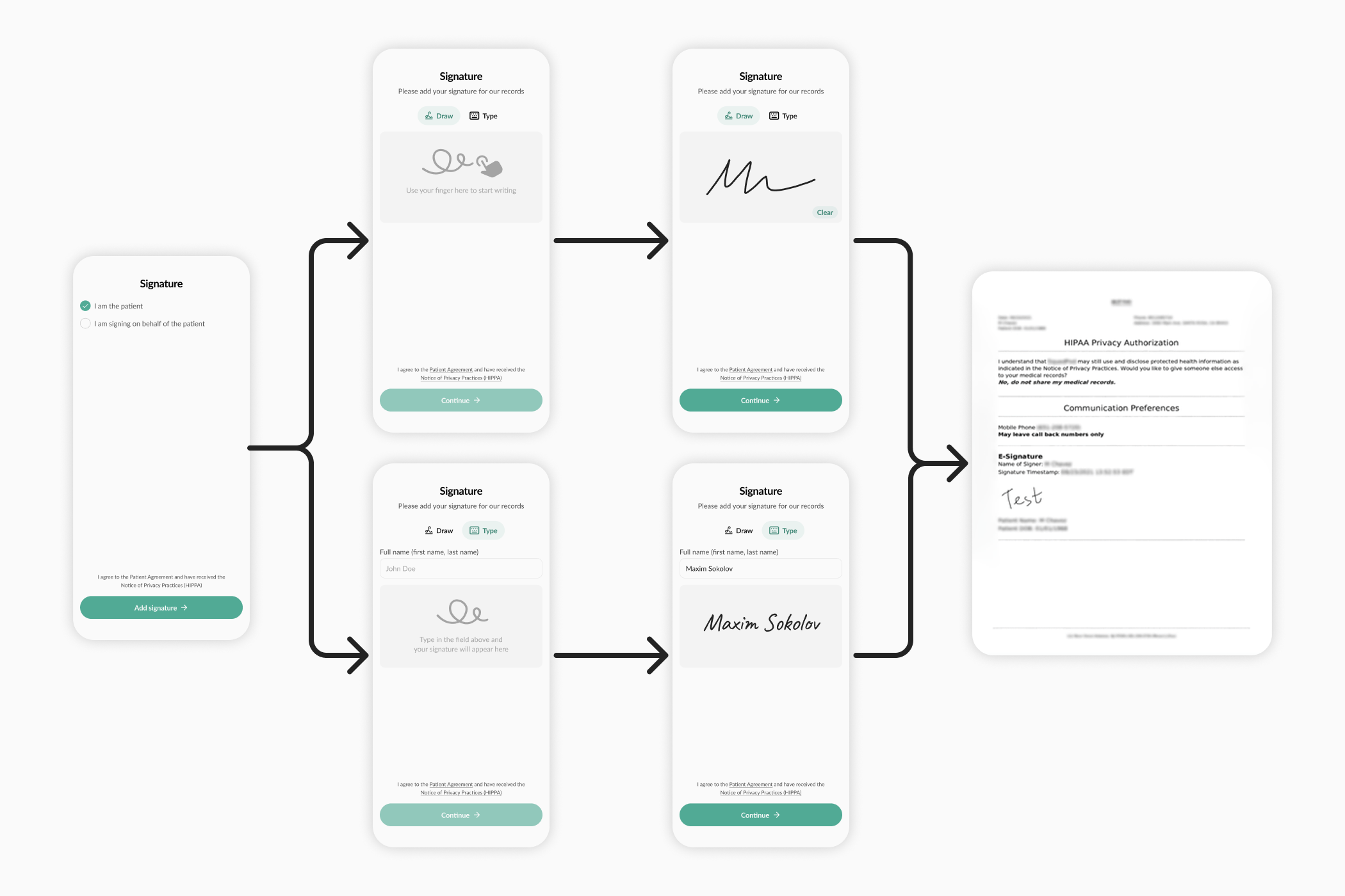
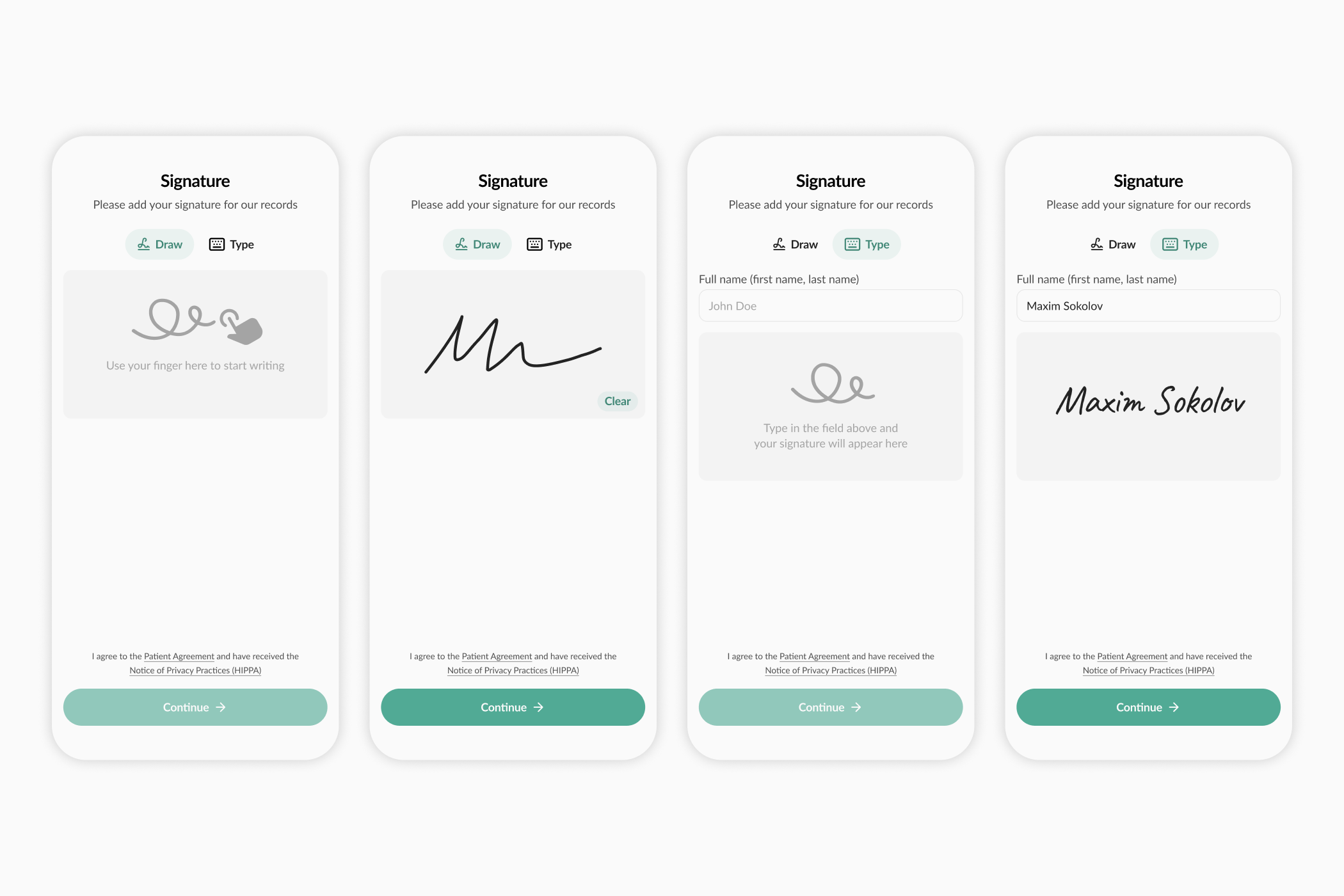
Results
- 60+ of the 93 audit tickets resolved and handed off dev-ready within the 3-month window, a 64% reduction in accessibility debt.
- Pre-Visit moved meaningfully closer to full WCAG 2.1 AA compliance: from significant access barriers to a product that works for assistive-technology users.
- The remediation process, documentation system, and cross-functional workflow I established remained in place for the team to build on after my departure.
- Contributed to a 10% increase in check-in completion after remediation.